
Messy Middle
Finding a cover and a printer for Friendly Demons

It’s Halloween, it’s Samhain, the veil between the worlds is thin and I want to show you what’s cooking and bubbling in my cauldron. I thought it would be interesting for you to see a bit more the messy process of creating and publishing a book (rather than a pristine: look, I did this), as I am in the middle of it right now.
As you may know, I am currently working on a book called Friendly Demons, a non-fiction about mindset, self-care and practice for creatives. A book born from the struggles I experienced and witnessed as a full time author-illustrator these past 10 years, where I share the thoughts and shifts that have helped me and will continue to help me on my way forward.
In my previous letter, I told you that I was hoping to get it published by the end of the year. How optimistic of me. We’re now at the door of November and I can tell you for sure that won’t happen. And that’s probably a good thing. No matter how impatient I get, I am unable to rush things, to skip over details, to leave questions unanswered. To complete this sort of project, you need to answer a lot of questions. Some big, some small, and countless invisible decisions in between.
As I was writing this, the voice of Meryl Streep from the 1986 movie adaptation of Karen Blixen’s Out of Africa came to my mind. She says:
“Perhaps he knew, as I did not, that the Earth was made round so that we would not see too far down the road.”
This is a sentence with multiple meanings, but at this moment it expresses something specific for me: we launch ourselves into projects unable to see all the twists and turns on the way, and maybe that’s what we need to maintain our stamina and take one step after the other. If we could see the length and state of the road ahead of us in all its details, I’m not sure many of us would even begin the journey.
So, let me tell a little bit about the road I’ve travelled this month and where I ended up.
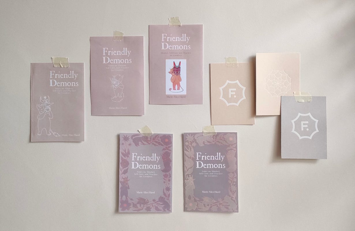
At the start of October, I thought I would work on the cover for a week (I already had sketched out some ideas and color palettes, pictured below, and had a pretty clear idea of what I wanted), design the book in a few days and knock at my favourite printer’s door for a quote. Surprise surprise, it didn’t exactly go as planned.
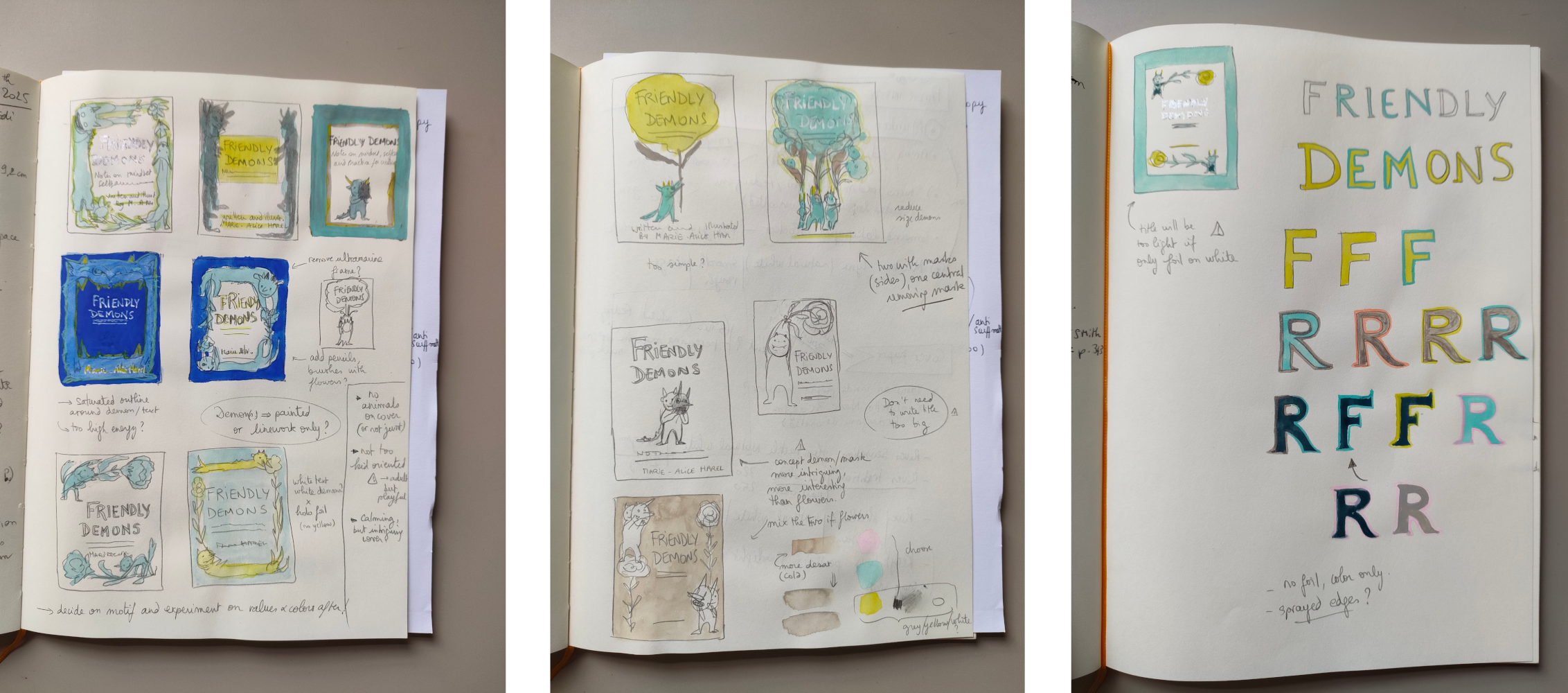
I spent the first two weeks of October on the cover, and after (literally) hundreds of different versions, I still wasn’t entirely happy with what I had. In the second week I also started to design the inside of the book. That raised new questions, and in time, answers, about what the look and color palette this book needed. My initial plan was to have a turquoise and yellow cover, with colorful illustrations inside the pages. While I was roaming my bookshelves and the Edinburgh bookshops looking for inspiration, studying the market for this specific genre, I quickly realized that my initial idea was too colorful. All the books that I felt a connection with in my wanderings had very neutral and light palettes. Friendly Demons can be placed on two different shelves: art and smart thinking, and each one of these have their own graphic currents. The cover concepts I had so far did not really work with either. They were sending the wrong message for the book I was trying to create.
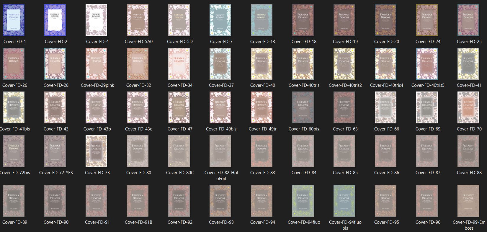
The danger with the characters on the cover is that they look too cute. They’re attracting all the attention. This is a book for adults, which grapples with serious and deep questions about fear, mental health, and our personal connection with meaningful creativity. My book was starting to look too much like a book of stories for children: I love it, but it’s not the right fit in this instance. That’s when I started rethinking the whole color theme, starting from the pages themselves and making my way back to the cover. Friendly Demons needs a clean, light, and quite restrained approach. Something comforting and uplifting, maybe a little intriguing, that can simultaneously convey the depth and weight of the subject.
People say all the time that we should not judge a book by its cover, but I disagree. That’s exactly what covers are for: to let the reader understand what the book will be and feel like. This sentence should only applies to great books with terrible covers (or terrible books with beautiful covers), and even that is a bold statement as tastes differ. If the artists, designers, art directors and publishers have done their work well, a cover should be a good match for its book.
But of course, covers are tricky to get right. In addition to sending the right message, condensing the essence of an entire book into a single page (without showing too much), they also have to stand out from the shelves while at the same time fitting into, to some degree, the genre they belong to. They have to build on the existing market and push it further, so that it feels familiar enough to meet people’s expectations while at the same time make them curious and catch their eyes. And of course, they have to fit the vision and essence of the publisher. Tricky. It’s a subtle and difficult balance – I should say it’s an art.
After looking at the cover for days on end non stop, making countless adjustments but never being fully satisfied with the results, I took a break by researching paper options for a few days. That gave me new ideas for the cover, using foils and/or embossing rather than printing for a more subtle look. But still, I wasn’t entirely convinced. Until one evening, before going to bed, I tried this new option below:
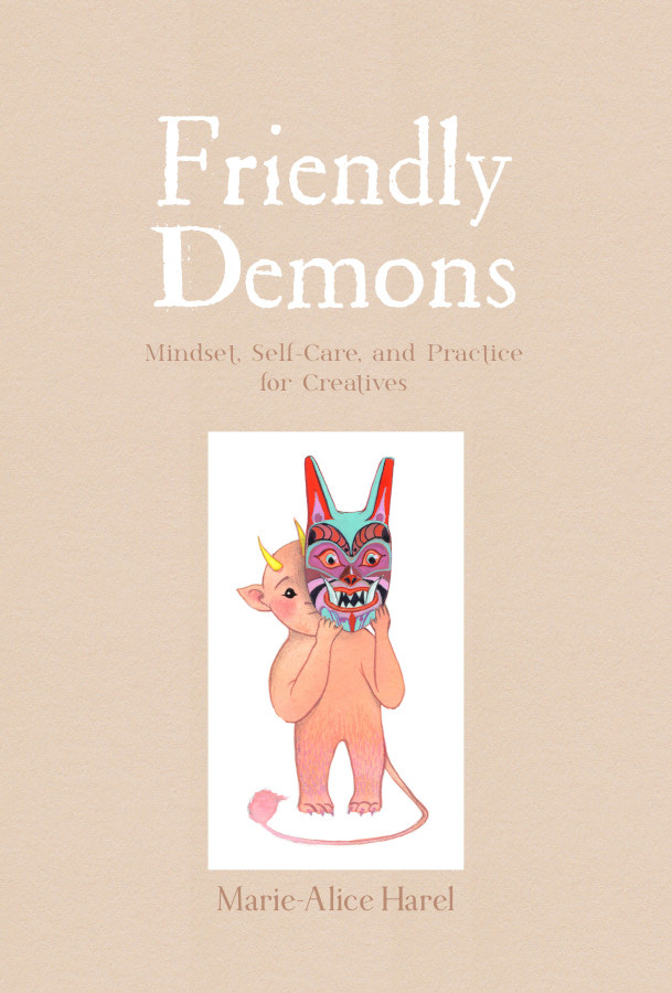
I’m going to tweak things a little bit more. But I think this is the right cover for the book. In a way, it’s a simpler, more straightforward idea - and those are often the strongest.
Finding the perfect cover for your book is one thing, moving that idea from the mind onto paper is another. As soon as I felt I was getting somewhere with the book design, I started looking for quotes with the printers. And that’s where, as Karen Blixen would say, another bend in the road was waiting for me.
Since the last time I published a book, the price of paper (and pretty much everything else) has increased a lot. Almost doubled, it seems. For a micro-publisher like me, this has serious consequences and I must admit I despaired a little bit last week. Everything costs more and more to ship and produce, but people still expect to pay a certain price for a non-fiction paperback. For someone like me who always tries to over-deliver, who wants the good paper, the durable design, the emphasis on details and quality, while keeping things affordable... it doesn’t work. Something has to give.
So I went back to the bookshops (sorry, Edinburgh bookshops, for haunting your shelves so much this month) and in addition to looking at book designs and covers, I also took note of where the books were printed.
I’ve always tried, even more so in the past few years, to produce all my stationery and books locally. Better for the planet and the people. But in this case, I have been unable to find a printing solution in the UK that didn’t undermine my quality standards, or reduce my already low profit margins to an unsustainable percentage. So I am now researching and contacting printers in eastern Europe and China. I’m not entirely happy about it, and that solution comes with its own set of problems (transport, custom duties, environmental cost...) but I’m not a miracle worker. I cannot move forward without compromises, no matter how hard I try. I have researched alternative papers, bindings, and cover finishes to see what I could and could not afford. I’ve considered and researched other printing processes, I’ve even contemplated removing all the illustrations and print the book in black and white.
But another significant compromise I can make is on the number of books I’ll order. With printers, the more you order, the cheaper the book per copy (because the set up is more costly than the materials). That’s how big publishers can make big profits, while offering beautiful books at a reasonable price point. As a one woman business (who stocks her books in her small flat/home), I cannot compete with traditional publishers who order tens of thousands of books, but I can still use this scale pricing to my advantage. So to be able to bring the book down to a reasonable sale price while maintaining my quality standards, I have to order twice as many books as I had initially planned (in this case, 1000 copies instead of 500 - in addition to getting the book manufactured outside of the UK). That means higher upfront cost, more risk, and more space needed to stock the books - but that also mean a book that people can buy without rolling their eyes at the price tag. This is where I am now, still tweaking design choices and costs, but starting to see the light at the end of the tunnel.
So there you go. That’s what has been bubbling in my cauldron and filling my head with questions, colors, and papers this month. I’m sure there will be more bends on the road ahead, but I’m getting closer and closer to holding a copy of Friendly Demons in my hands. A copy that I very much look forward to sharing with you.
I wish you a happy Halloween.
Ps: I decided to share this post in it’s entirety to all subscribers this month, I hope you enjoyed it. Finding the right way to share on this platform is also something that’s occupying my mind. It’s a work in progress to find the right approach. I want to share everything for free, but I also have to honor the time and effort that goes into creating quality content, as I want to share something valuable to you, not just noise to fill your inboxes. If you have thoughts or feedback on this, or wishes for future content, please leave a comment below or reply to the email.
It was so endearing to see the care and thought you put into all your choices. This is evident with your illustration and art, but getting to see all the work that goes behind making this viable in the real world adds more gravity to the art you make. More power to you! And may the book find its wings to go every place it will be truly valued and treasured. ❤️
I had a planned to have a graphic released, or at least in in production by last June, but here we are in November and I just have some vignettes scripted and some character designs done but nowhere near really in production yet haha. Luckily, other creative projects popped up (music) and I have to get those completed first (one of which has a real deadline and involves money), so the fun projects kind went by the side temporarily. Friendly little demons for sure! I am looking forward to your book!!